Saint Louis Chess Club Rebrand
![The Saint Louis Chess Club’s updated brand identity celebrates the city’s heritage with Saarinen’s modernist arch perched atop golden fleur de lis [a symbol of Saint Louis, and existing brand imagery for the Club], and highlights chess as a landmark](https://images.squarespace-cdn.com/content/v1/60e485b76931d2212ab2285c/858329a1-790a-4040-8bb5-bfce57cf1ac0/STLCC+Logo+Hero.jpg)
The Saint Louis Chess Club’s updated brand identity celebrates the city’s heritage with Saarinen’s modernist arch perched atop golden fleur de lis [a symbol of Saint Louis, and existing brand imagery for the Club], and highlights chess as a landmark of the United States' Chess Capital.

Chess Club Exterior Sign

Chess Club Website
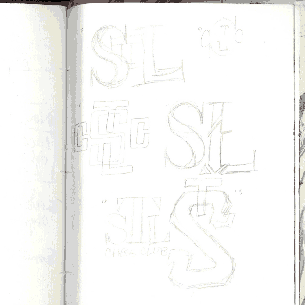
Process

Logo, Before and After

Chess Club Interior Sign

Monogram, Before and After The widened base of the slanted L, combined with the t on top, mimics the form of the King piece with its signature cross-shaped finial — the flanking C’s remain, losing their engraved look and now enjoy a modern symmetrical curve and elegantly angled serifs.

Logo Embroidery

Logo Mug

Logo Variations

Co-branded Logos

Branded Scoresheet
Photography by Austin Fuller and Lennart Ootes
Courtesy of Saint Louis Chess Club